
SAY IT
client
OXFORD UNIVERSITY PRESS
role
Brand Designer
UX/UI Designer
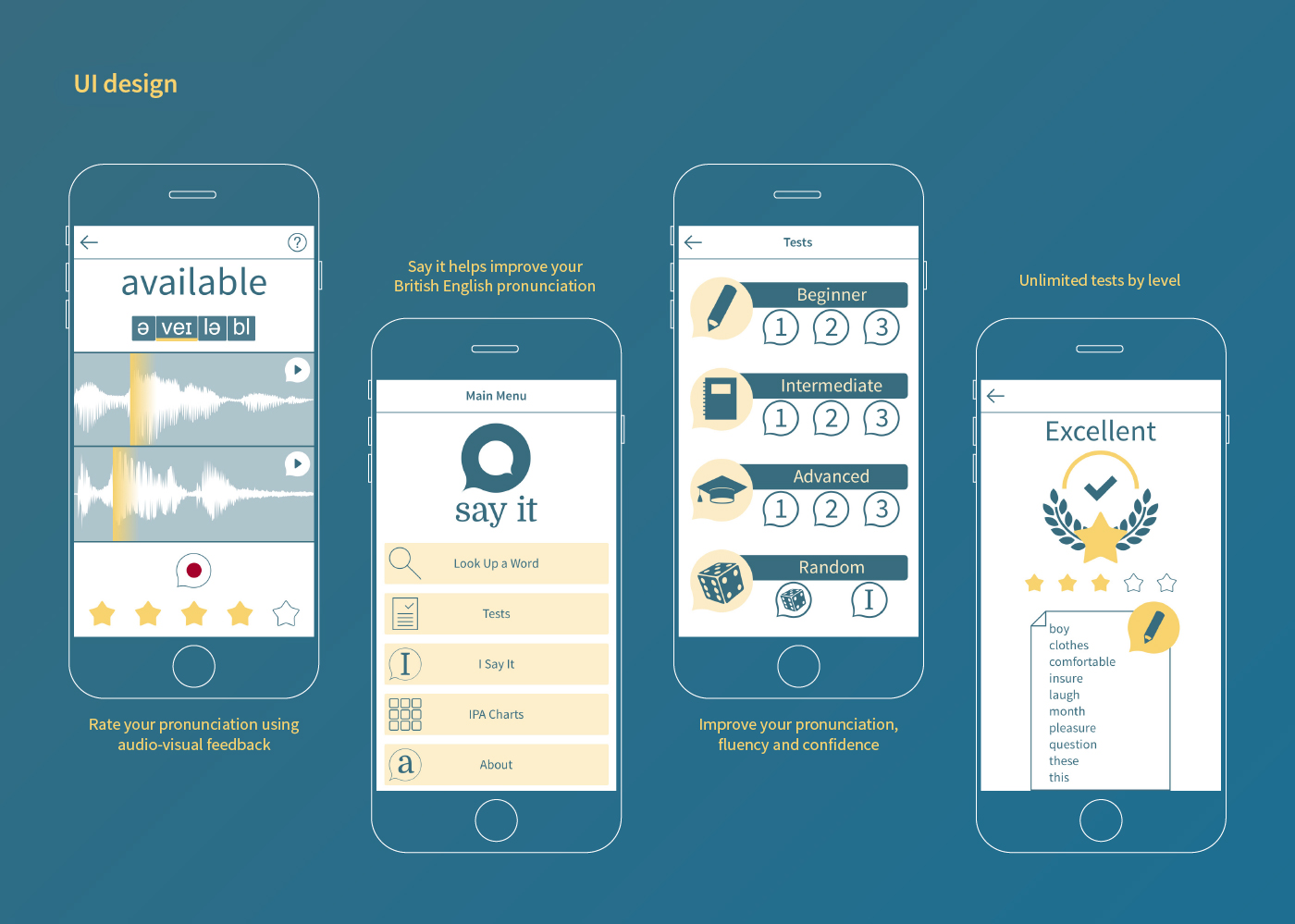
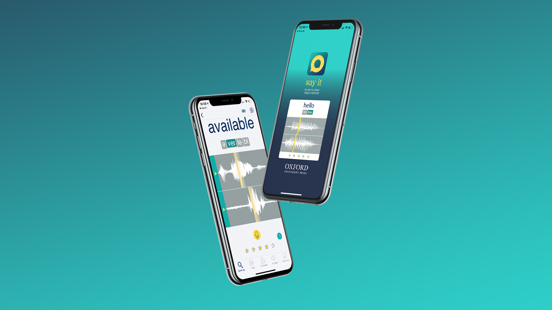
In 2014 I collaborated as a Lead Designer with Oxford University Press to the iOS app Say it, an app that teaches how to improve English pronunciation with personalized audio-visual feedback - includes 30,000 model recordings from Oxford University Press.
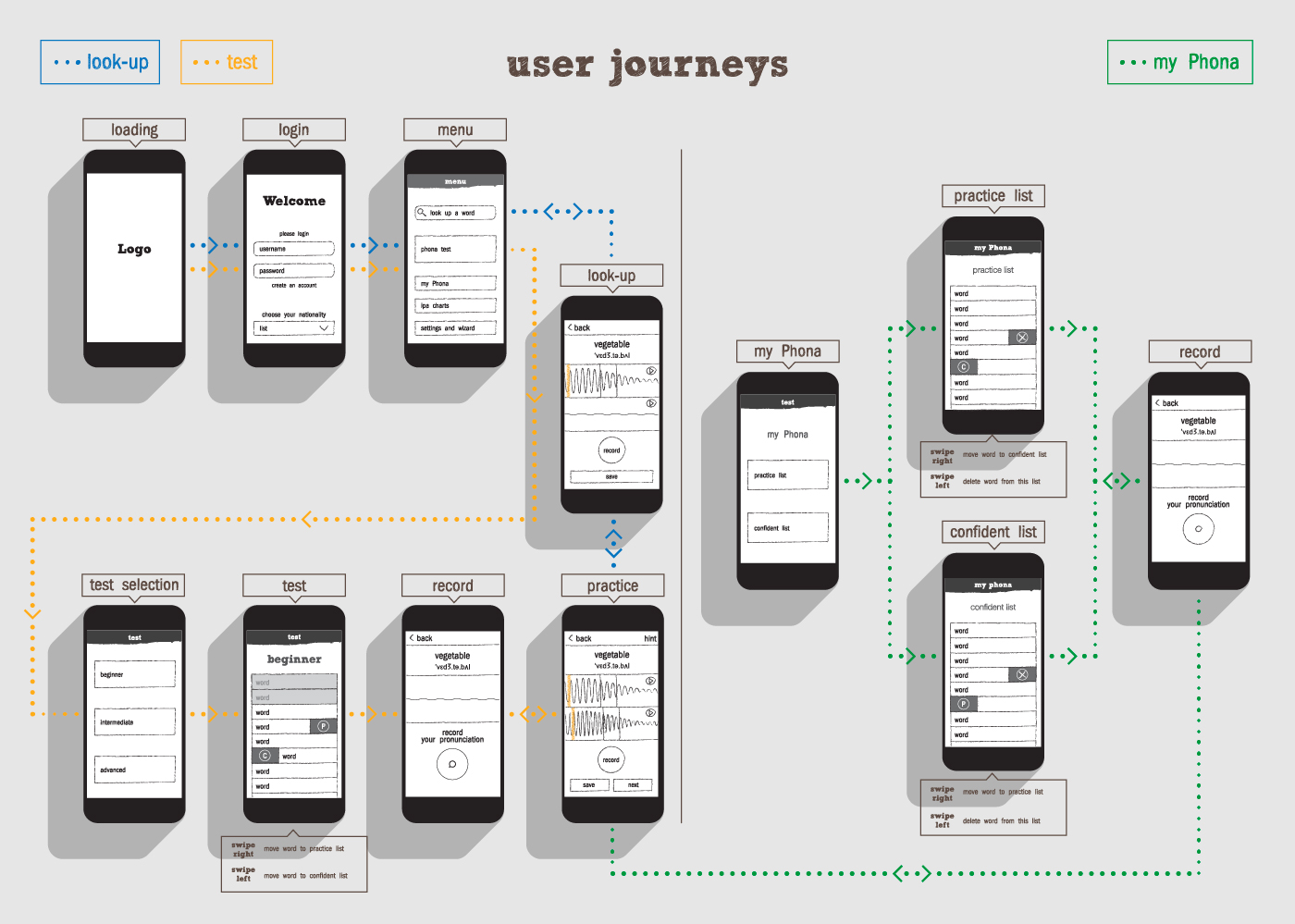
Everything started by participating in UX research. Working closely with the Developer and the Educational Lead, I structured the wireframe of the app. Then I created the logo and brand identity. Following the new brand's style, I came up with the UI put in place by the developer.
The app was also chosen as the winner of the English Speaking Union's 2016 'President's Award For New Technology In English Language Teaching'. In 2018 the app was featured in the Chinese iOS app store in the education section.
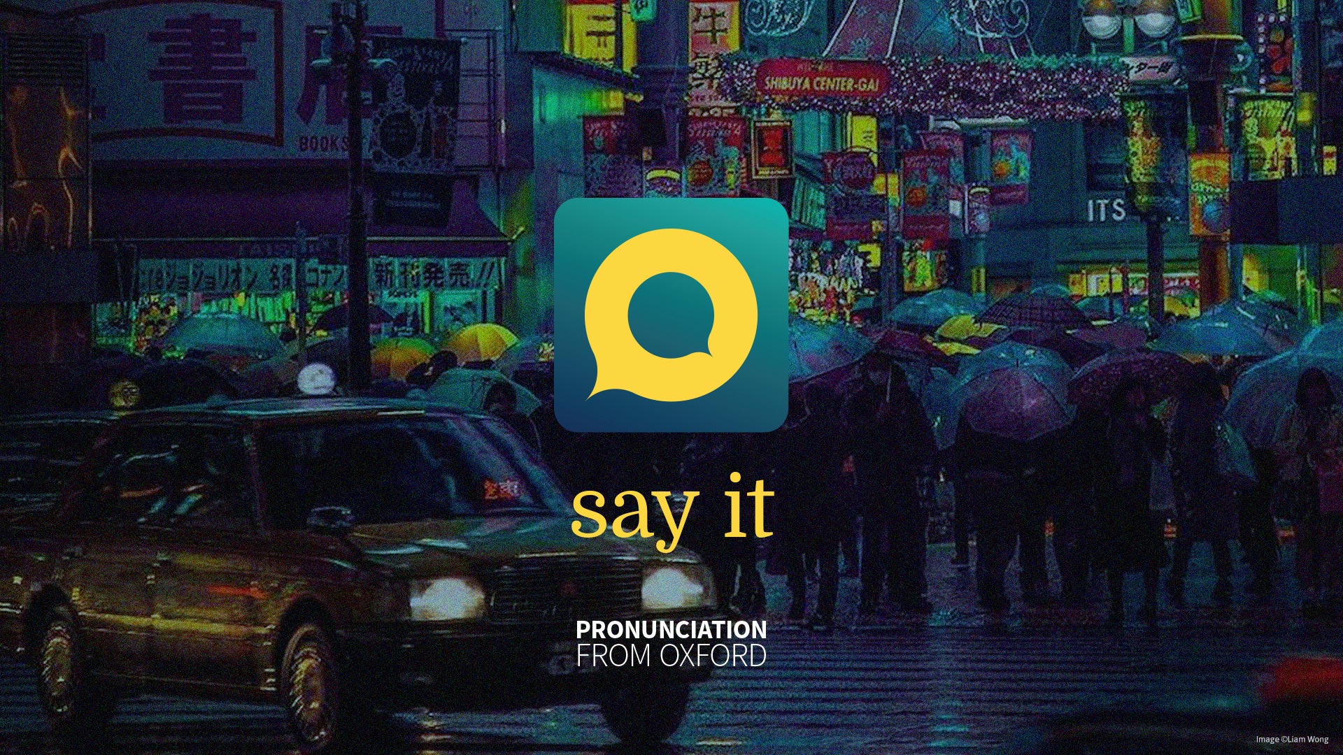
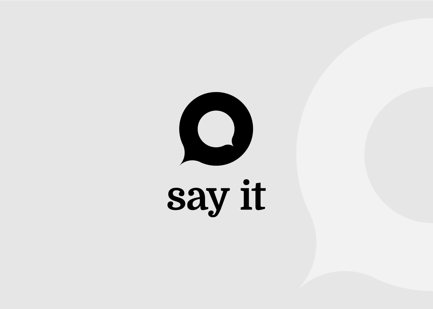
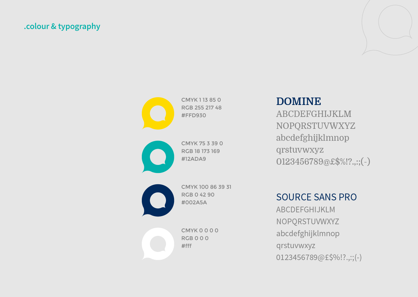
The app's core feature is the visual comparison of the user word pronunciation with the Oxford University Press official pronunciation. I designed the logo to reflect this with two speech bubbles, the one outside taking care of the small inside. When improving the pronunciation of a new language, the lead of a master is the best way to do it. The font Domine (from Latin word Dominus, master) combines the serif aspect with a bold impact, and it has been paired with a font with good legibility on screens, Source Sans Pro.
© ruggero gualdesi 2024
© ruggero gualdesi 2024
© ruggero gualdesi 2024
© ruggero gualdesi 2024